Calligraphy in the Book of Kells The script in the Book of Kells
The script in the Book of Kells
127 comments
One of the most distinctive features of the Book of Kells is its neat script, a form instantly recognisable as being of distinctively Irish or Insular in style.
A library catalogue compiled for the monastery at St Gallen in Switzerland c. AD 850 described the presence of libri Scottice scripti (books in ‘Scottish’ [Irish] script). The singling out of a group of manuscripts specifically for their ethnic distinctiveness was quite unusual at this time, and emphasizes how even in the early medieval period, manuscripts produced by the Irish Church were seen as different.
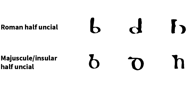 Fig 1. Insular letter forms compared with contemporary ‘Roman’ forms
Roman scripts were probably introduced to Ireland from Britain, possibly from as early as the fourth century. However, by the late sixth century, possibly due to isolation from continental developments, a distinctive ‘Insular’ script had developed. This first emerged in majuscule (‘uppercase’ letters usually of even height, also known as Insular half uncial). This is the script that is used predominantly in the Book of Kells.
 Fig 2. Example of majuscule script in the Book of Kells © The Board of Trinity College, University of Dublin.
Once established, the script was also written more cursively, producing minuscule (‘lower case’ letters where the ascenders and descenders extend beyond the body of the letter). Minuscule was used to create manuscripts for personal or everyday use, while majuscule, which took longer to write, is often a feature of higher status books.
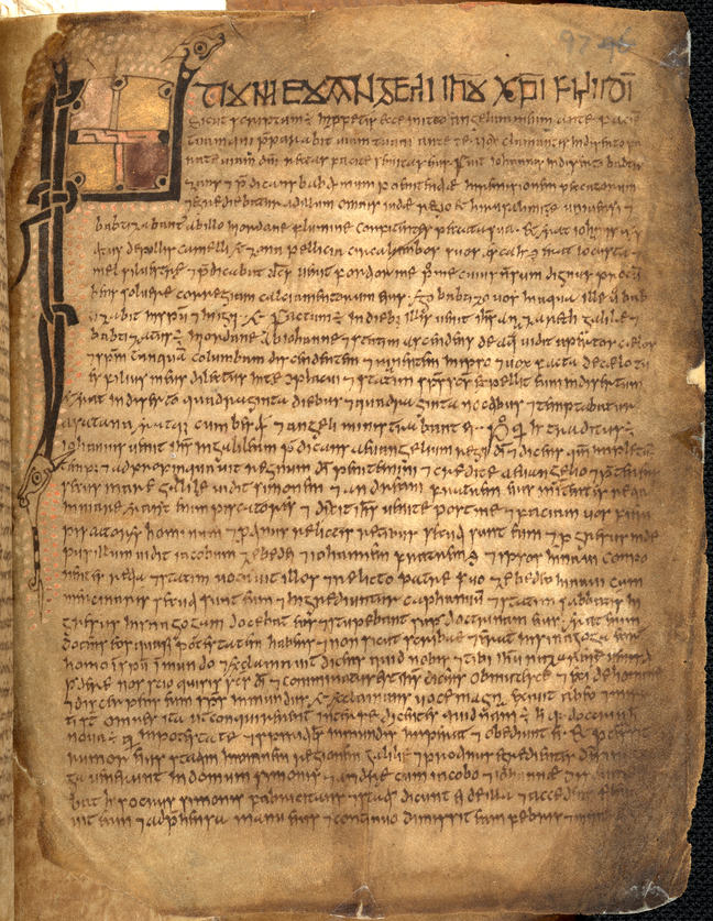 Fig 3. Example of minuscule script from the Book of Mulling (fol. 97r). © The Board of Trinity College, University of Dublin.
Typical insular script is characterised by the triangular forms (known as wedge serifs) of ascenders (such as b, d, h etc.) and sometimes descenders, and the particularly broad bows of letters such as b, p and q. Specific combinations of consecutive letters (known as ligatures) and standardised abbreviations were also developed. Diminuendo, where letters diminish in size from an opening large initial, and stippling, or dotted backgrounds to letters, are also common features.
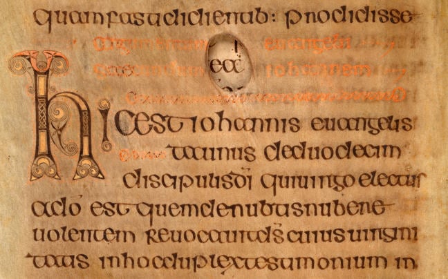 Fig 4. Example of diminuendo from the Book of Durrow (fol. 19v.). © The Board of Trinity College, University of Dublin.
For particularly important passages in manuscripts, including the Book of Kells, a distinctively geometric form of display capital was used. These letter forms are thought to have originated in Northumbria, where they are most common, possibly under the influence of angular runic script.
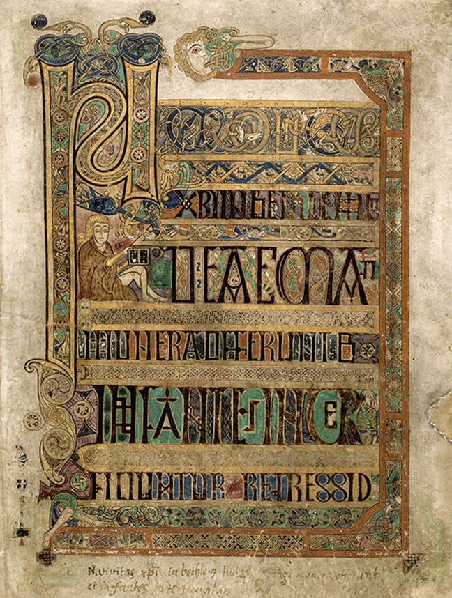 Fig 5. Example of display script from fol. 8r, a passage from the Breves causae of Matthew that refers to the birth of Jesus Christ. © The Board of Trinity College, University of Dublin.
Although most common to manuscripts, Insular scripts were used for inscriptions on contemporary carved stones and fine metalwork. They continued in use for texts in the Irish language in both manuscripts and inscriptions throughout the medieval period, and only finally fell out of use in the early twentieth century.
Tim O'Neill is widely regarded as one of Ireland's finest calligraphers. His artwork ranges from designs for British Airways planes in Celtic style, to designs for Irish postage stamps. A research fellow here at Trinity College, he's also an authority on the Irish scribal tradition. Let's imagine we are back in early Ireland, and you are a student learning to write in the scriptorium. Now, we don't know for certain how they did this, but here's a possibility. That they broke the alphabet down into its basic forms. And the first thing you learned to make was the key letter of the alphabet -- you could call it the father of the alphabet -- would be the letter I.
It was made very simply, across like this, and then down. And then you come to the mother letter of the alphabet, which is the letter O. It's made in two parts, starting at the top and coming down like this, going back up, and coming down the other side. Always made in two parts. So with the I and the O, if you can master those, you have about one third of the letters of the alphabet. Because the rest of them, it's almost like playing with LEGO. You're putting little bits together.
For example, if you want to make a letter C, you start off exactly like O, and then you go back up and you come down the other side, and then you stop. And that becomes -- start again like a C, and then you go out like this and it becomes an E. So then you get three letters at the one time. Similarly with the I. And then if you want to make a J, you just come a little bit below the line like this. And so that's the way they learn the elements of putting them together. For us, nowadays, in about an hour or two, you can learn the whole 26 letters.
In the Book of Kells, and in all the early Irish manuscripts, you'll find that there are basically two design elements. One is based on spirals, and the other is based on interlace. The spiral is a very old motif in the Irish tradition, goes back to the Neolithic, even. And it's really a circular form, which goes around like the shell of a snail. So that's a basic spiral. And then the next thing you can do with it is make it like in the shape of an S, or then possibly in the shape of a C. Now, the only other thing you can do with these spirals is link them up.
So if you're trying to link them up -- do your S like this -- and you just make sure there's enough room to come out, like this, and then down into the next one here. And then it comes out like this, and so on. Very, very simple shape and form. Now, when we come to the other, the interlace, there's two ways of doing it. The simplest and most basic would be look at what is the simplest knot you can make. And it's this one. Like this, like this, and then you link up those two. And you go double it up into a ribbon. Follow around the same way.
And then you go and you do over and under, like you can imagine you go along. Say it goes over this one, and then it gets to go under the next one, and then under this one, and then over here, again. And it always works out as over and under, like so. And these would've been used basically as a space filler. So if you can imagine the middle of a letter A, capital A here, into the space, they would put one of these interlaced patterns. And it could be very, very tiny. That's a very, very absolute basic way. Now, the more complicated designs -- apparently they used a grid, where they use dots.
And they went using the dots as guides. They were able to construct very, very elaborate patterns. The secret being that you never join the dots. You keep away from the dots, but you used them as guides. But if you join the dots, you can't get it right, it won't work out. But if you keep away from the dots, and use them to go around them, and use it as a basic pattern you can create very, very elaborate designs. And then, of course, what you're working with is a ribbon. And within the ribbon itself, you can put a border on the ribbon, which makes it even -- looks more complicated, but actually it's very, very simple.
The neat hand used to transcribe the bible text into the Book of Kells is a beautiful example of the skill of the medieval scribe. We look at some of the basic skills required to form the individual letters used in the Book of Kells. We also take two of the basic motifs, spirals and interlace, and show how to start building a design of the type that proliferated throughout the manuscript.
In the next step, we will be asking you to try some simple calligraphy and share it with other learners.
© Trinity College Dublin, the University of Dublin

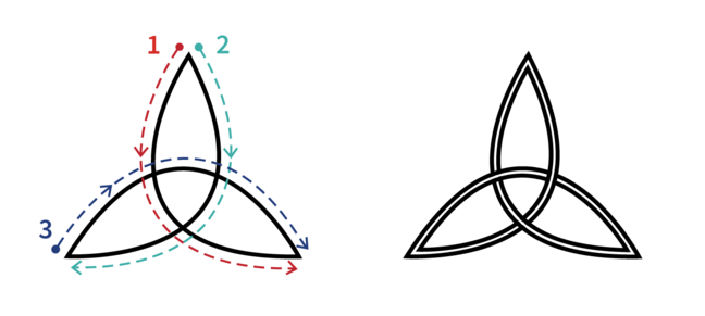 Simple knot, ribbon
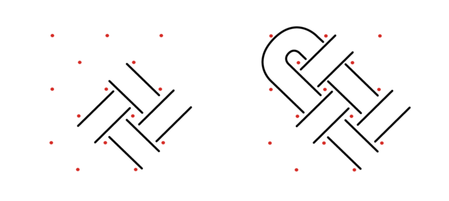 Interlace ribbon created with a grid
In the last video, Tim O’Neill showed us how to do some simple illustrations that can be found in the Book of Kells.
Spirals

Interlace
 Simple knot, ribbon
 Interlace ribbon created with a grid
Thinking about these illustrations
We would like you decorate a letter in the style of the Book of Kells. You can use spirals, interlaces, or any of the symbols or animals you have come across in the book or in this course.
- Pick and draw any letter of the alphabet, or print out this page that has two example letters, T and G
- Use any pen, pencil or markers to decorate the letters
- Consider how a scribe would have decorated the letters using spirals, interlace, crosses, lozenges etc…
- Think about the amount of time it took you to complete this drawing, and its scale. This will give you some insight into the skill of the Book of Kells scribes and artists.
- Take a photo or scan your picture.
- Upload the picture onto our Padlet which you can access below.
Note: this is an optional exercise.

Postar um comentário